Download free Xenippa font - xenipp3U.ttf
About Xenippa font
Based on French Bastarda writing and some -- freely handled -- Rotunda capitals, this font has no match in historic documents. It's a first try to combine imitation and imagination.
Just in case the term Rotunda is news to you: this means the style of formal writing used in Italy during those centuries when the rest of Europe was writing Black Letter. They never took to acute angles and steep curves in Italy, neither in architecture -- where they directly moved on from the Romanic style to the Renaissance, leaving the French gothic to the barbarous north -- nor in writing; developing and preferring a style that was clear, and straight, and rounded, and by far better legible than the crammed and distorted Black Letter weaving. It seems however legitimate to tamper with Rotunda capitals, for the original scribes were pretty often given to do it themselves. Lower case letters don't hold much potential for variation, so they took their revenge on the upper case. Invention is mightily at work there, and some writers seem to have deemed it artistic bankruptcy to employ the same shape of an upper case letter twice on the same page, or even in the same chapter. All of which is to say that I didn't go far out of their way by creating some Rotunda capitals of my own.
The name 'Xenippa' is Ancient Greek and means 'having strange (= not one's own) horses'.
Update 2007 has reduced the file size, by redesigning the composite glyps, has added an s that sits on the line, as well as a Yen sign, has corrected the Ldot/ldot, and has moved some of the special characters. These are now
- an et ligature on the left curly bracket
- an st ligature on the right curly bracket
- the new alternate s on the bar and broken bar sign
- a double long s on the long s sign
- a long s+t ligature on the 'not equal' sign
- The alternate C and E have gone off to the masculine ordinal indicator (fi, 'less than or equal to' sign) and feminine ordinal indicator (fl, 'greater than or equal to' sign); and the alternate G can be found on the 'divide' sign.
The long s, however, still keeps its place on the number sign.
Update 2010 has enlarged the dashes, has the composite glyphs redesigned (especially the dcaron, Lcaron/lcaron, and tcaron), and has created a new m.
Buy a commercial license
Download font
Free for Personal Use
This fonts are authors' property, and are either shareware, demo versions or public domain. The licence mentioned above the download button is just an indication. Please look at the readme-files in the archives or check the indicated author's website for details, and contact him if in doubt. If no author/licence is indicated that's because we don't have information, that doesn't mean it's free.
Xenippa Regular | xenipp3U.ttf
- Font family: Xenippa
- Font subfamily identification: Regular
- Unique identifier: Xenippa:Version 1.30
- Full font name: Xenippa
- Version: Version 1.30 June 2010, initial release December 2003
- Postscript font name: Xenippa
- Designer: Pia Frauss
- Description: Xenippa was created with the Font Creator Program from High-Logic.com
- License: If you want to use this font commercially, please visit http://www.pia-frauss.de/imp/cu.htm
Xenippa
Xenippa (UNICODE)
________________________________________
... was created by Pia Frauss in 2003, with High-Logic's FontCreator program; updated in 2005, 2007, and 2010, and set to UNICODE in 2007. You have downloaded version 1.30 (completed in 2010). I hope you'll enjoy this font.
Xenippa is free for private use. For commercial use, please visit my "Conditions of Use" page at
http://www.pia-frauss.de/imp/cu.htm
Based on French Bastarda writing and some -- freely handled -- Rotunda capitals, this font has no match in historic documents.
The name 'Xenippa' is Greek and means 'having strange (= not one's own) horses'.
UPDATE 2007 has reduced the file size, by redesigning the composite glyps, has added an *s* that sits on the line, as well as a Yen sign, has corrected the *L/ldot*, and has moved some of the special characters. These are now:
- an *et* ligature on the left curly bracket
- an *st* ligature on the right curly bracket
- the new alternate *s* on the bar and broken bar sign
- a double *long s* on the long s sign
- a *long s*+*t* ligature on the 'not equal' sign
The alternate *C* and *E* have gone off to the masculine ordinal indicator (*fi*, 'less than or equal to' sign) and feminine ordinal indicator (*fl*, 'greater than or equal to' sign); and the alternate *G* can be found on the 'divide' sign.
The *long s*, however, still keeps its place on the number sign.
UPDATE 2010 has enlarged the dashes, has the composite glyphs redesigned (especially the *dcaron*, *L/lcaron*, and *tcaron*), and has created a new *m*.
_________________________________
Disclaimer:
1. The designer as well as owner of this font is Pia Frauss.
2. This is a free font, but it is restricted to personal use only. Commercial use may be obtained by paying a licensing fee.
3. This font may not be included in any commercial compilation of fonts, be it on CD, disks or other products, without the owner's permission.
4. Altogether, this font may not be used for commercial ends and financial gain without the owner's permission.
5. This font may be freely distributed, as long as the zipfile, including this text, remains unaltered.
6. This font comes as it is. There is no warranty -- express or implied -- offered by the owner, or supplier. The risk of any losses or damages resulting from the use of this font remains wth the user.
If you need any information not supplied by this or by the http://www.pia-frauss.de/ website, please write to fonts @ pia-frauss.de (please remove the spaces around the *@* before copying the address into your mail form).
(However, please note that no enquiries such as "how do I download/install/get such and such program to work with your fonts" will be answered in the future.)
More by Pia Frauss
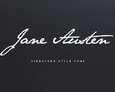
Jane Austen Signature font
Download Jane Austen Signature font free | Pia Frauss

SonOfTime font
Download SonOfTime font free | Pia Frauss
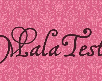
MalaTesta font
Download MalaTesta font free | Pia Frauss
Comments (0)
Lastest update
Cherona font
Download Cherona font free | Dafont Free
Emak font
Download Emak font free | Dafont Free

Ensatulogi font
Download Ensatulogi font free | Dafont Free
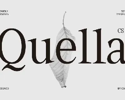
CS Quella font
Download CS Quella font free | Dafont Free
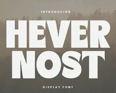
Havernost font
Download Havernost font free | Dafont Free

Golict font
Download Golict font free | Dafont Free
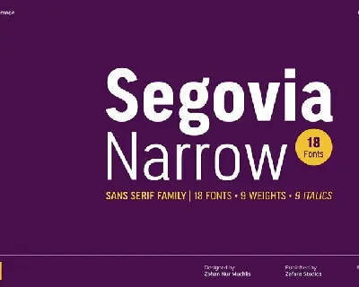
Segovia Narrow font
Download Segovia Narrow font free | Dafont Free
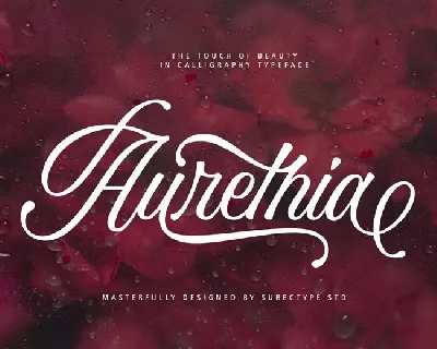
Aurethia font
Download Aurethia font free | Dafont Free

Nature Keystone Family font
Download Nature Keystone Family font free | Dafont Free

aeromove font
Download aeromove font free | Dafont Free
