Download free MalaTesta font - malatCKU.ttf
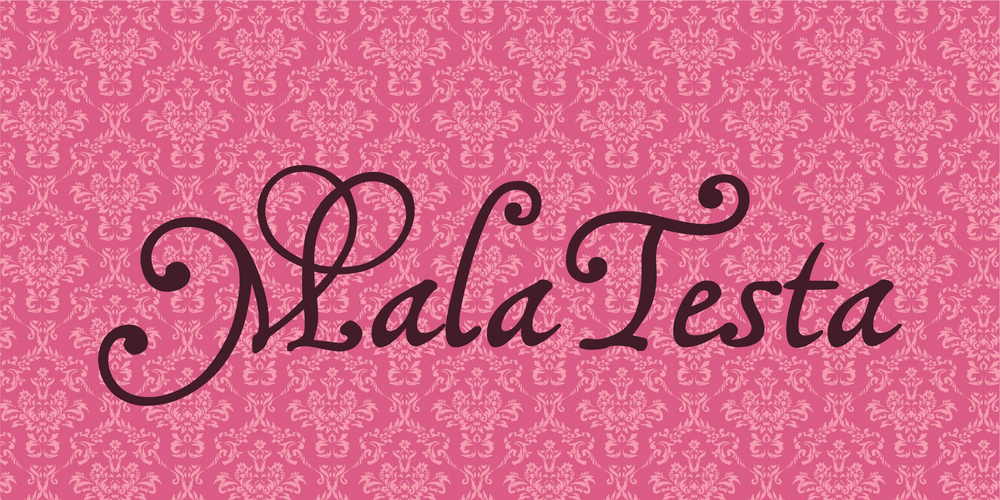

About MalaTesta font
The MalaTesta fonts are based on a writing sample, titled "Lettere piacevolle", and dating from the 16th century. I copied it out of a book from the library, years ago, but forgot to include the caption, and kept no notes concerning the source. After turning it into a font, I had to search the Net for information ... and I found it! Doing a search for that queer title led me to a Google book, by Lewis F. Day, on Penmanship of the 16th, 17th, and 18th century, which is displaying my writing sample (among lots of others), and stating that it was taken from A booke containing divers sortes of hands, published by J. de Beauchesne and J. Baildon, in 1571. Apparently, Beauchesne/Baildon didn't name the writing master who created this "rather fantastic italic hand" -- quoting Lewis F. Day's judgment here; and I don't think he meant it in an altogether favorable way.
(BTW, that precious Google book, which is downloadable as a free PDF, even contains two samples of Francisco Lucas' penmanship -- though not those my font is based on, and certainly not the best he ever created.)
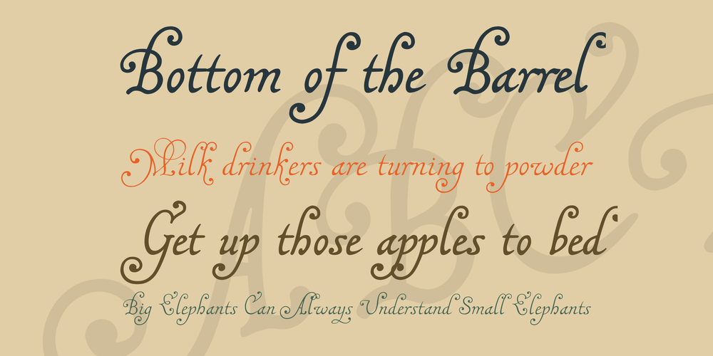
This is essentially one font that comes in two weights. I called them MalaTestaCK and MalaTestaN, because ck and n are the consonants that distinguish the words 'thick' and 'thin'. However, it is likely this denomination will not last. By next update, both fonts may be assembled into one family. As to the name MalaTesta, I sincerely hope you'll never find out why I think it's self-explaining...
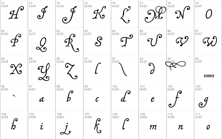
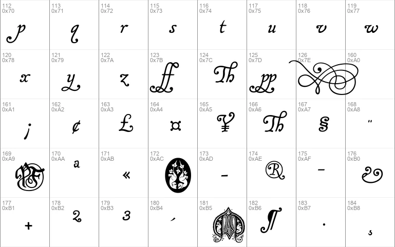
... for, sorry to say, these fonts can get quite messy. All of those curls, and hooks, and swashes, which may produce rather pretty effects in the right places, will get horribly entangled in the wrong ones. I did a lot of kerning, but, I fear, not nearly enough, and then there are still some odd combinations of characters, where all the kerning in the world will not help. So, the use of alternate characters, in these fonts, should not be avoided. They have been designed, not to make the font look more elaborate, but to simplify things. Let me implore you to at least use the bar or broken bar sign, whenever you want to type a Th in one of these fonts.
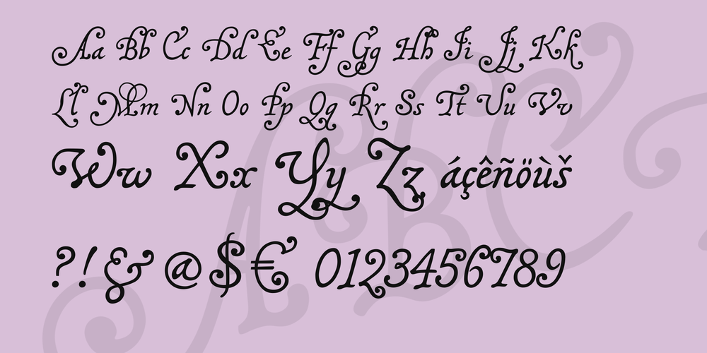
On the number sign of the MalaTesta fonts, you'll find a long s, as usual. The other irregular characters are
- an alternate g on the 'plus' sign
- a double g on the 'equal' sign
- an alternate y on the 'less' sign
- an alternate p on the 'more' sign
- a Th on the 'bar' and 'broken bar' sign, which you are strongly recommended to use, since no amount of kerning can make the regular T
- a simple l, without the top curl, on the left bracket, which you are strongly recommended to use, too, whenever an l is followed by another l, or a b, f, h, or k ... it will look a lot less messy!
- an alternate d on the right bracket
- a double f on the left curly bracket
- a double p on the right curly bracket
- a curly ending e on the 'degree' sign
- a little swash on the ASCII circumflex sign, that is best used to make a t preceded by an s, c, e etc look like a ligature. It has to be typed like an accent, before the t.
- a bigger swash on the ASCII tilde sign, to be used wherever it fits
- a double long s on the long s sign
- and, just in case, if you really need a 'plus' sign with this font, you'll find it on the 'plus/minus' sign.
Ah, yes, the images on the micro sign are wholly unconnected to the fonts, and were designed after some rather funny initials from a medieval codex. Believe it or not, they are meant to be an M and a T.
Download font
Free for Personal Use
This fonts are authors' property, and are either shareware, demo versions or public domain. The licence mentioned above the download button is just an indication. Please look at the readme-files in the archives or check the indicated author's website for details, and contact him if in doubt. If no author/licence is indicated that's because we don't have information, that doesn't mean it's free.
- malatCKU.ttf
MalaTestaCK Regular | malatCKU.ttf
- Font family: MalaTestaCK
- Font subfamily identification: Regular
- Unique identifier: MalaTestaCK:Version 1.00
- Full font name: MalaTestaCK
- Version: Version 1.00 June 2010, initial release
- Postscript font name: malatestack
- Designer: Pia Frauss
- Description: MalaTesta was created with the Font Creator from High-Logic.com
- License: If you want to use this font commercially, please visit http://www.pia-frauss.de/imp/cu.htm
MalaTestaN Regular | malatNU.ttf
- Font family: MalaTestaN
- Font subfamily identification: Regular
- Unique identifier: MalaTestaN:Version 1.00
- Full font name: MalaTestaN
- Version: Version 1.00 June 2010, initial release
- Postscript font name: malatesta-n
- Designer: Pia Frauss
- Description: MalaTesta N was created with the Font Creator from High-Logic.com
- License: If you want to use this font commercially, please visit http://www.pia-frauss.de/imp/cu.htm
MalaTesta
MalaTesta (= MalaTestaN & MalaTestaCK)
__________________________________________________
... are UNICODE fonts created by Pia Frauss in 2010, with High-Logic's FontCreator. You have downloaded version 1.00 of both fonts.
This is essentially one font that comes in two weights. I called them MalaTestaCK and MalaTestaN, because ck and n are the consonants that distinguish the words 'thick' and 'thin'.
You are welcome to enjoy these fonts.
The MalaTesta fonts are free for private use. For commercial use, please visit my "Conditions of Use" page at
http://www.pia-frauss.de/imp/cu.htm
The MalaTesta fonts are based on a writing sample, titled "Lettere piacevolle", and dating from the 16th century. Apparently, it was first published in 1571, as part of "A booke containing divers sortes of hands", by J. de Beauchesne and J. Baildon. Beauchesne/Baildon seem to not have revealed the name of the writing master who created the sample.
As to the name MalaTesta, I think it's self-explaining -- for these fonts can get quite messy. All of those curls, and hooks, and swashes, which may produce rather pretty effects in the right places, will get horribly entangled in the wrong ones. Therefore, the use of alternate characters, in these fonts, should not be avoided. They have been designed, not to make the font look more elaborate, but to simplify things. You might at least consider to use the bar or broken bar sign, whenever you want to type a *Th* in one of these fonts.
On the number sign of the MalaTesta fonts, you'll find a *long s*, as usual. The other irregular characters are
- an alternate *g* on the 'plus' sign
- a double *g* on the 'equal' sign
- an alternate *y* on the 'less' sign
- an alternate *p* on the 'more' sign
- a *Th* on the 'bar' and 'broken bar' sign, which you are strongly recommended to use, since no amount of kerning can make the regular *T* and *h* work well together
- a simple *l*, without the top curl, on the left bracket, which you are strongly recommended to use, too, whenever an l is followed by another *l*, or a *b*, *f*, *h*, or *k* ... it will look a lot less messy!
- an alternate *d* on the right bracket
- a double *f* on the left curly bracket
- a double *p* on the right curly bracket
- a curly ending *e* on the 'degree' sign
- a little swash on the ASCII circumflex sign, that is best used to make a *t* preceded by an *s*, *c*, e* etc look like a ligature. It has to be typed like an accent, before the *t*.
- a bigger swash on the ASCII tilde sign, to be used wherever it fits
- a double *long s* on the long s sign
- and, just in case, if you really need a 'plus' sign with this font, you'll find it on the 'plus/minus' sign.
The images on the micro sign are wholly unconnected to the fonts, and were designed after some rather funny initials from a medieval codex. They are meant to be an M and a T.
_________________________________
Disclaimer:
1. The designer as well as owner of this font is Pia Frauss.
2. This is a free font, but it is restricted to personal use only. Commercial use may be obtained by paying a licensing fee.
3. This font may not be included in any commercial compilation of fonts, be it on CD, disks or other products, without the owner's permission.
4. Altogether, this font may not be used for commercial ends and financial gain without the owner's permission.
5. This font may be freely distributed, as long as the zipfile, including this text, remains unaltered.
6. This font comes as it is. There is no warranty -- express or implied -- offered by the owner, or supplier. The risk of any losses or damages resulting from the use of this font remains wth the user.
If you need any information not supplied by this or by the http://www.pia-frauss.de/ website, please write to fonts @ pia-frauss.de (please remove the spaces around the *@* before copying the address into your mail form).
(However, please note that no enquiries such as "how do I download/install/get such and such program to work with your fonts" will be answered in the future.)
More by Pia Frauss
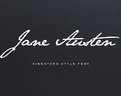
Jane Austen Signature font
Download Jane Austen Signature font free | Pia Frauss
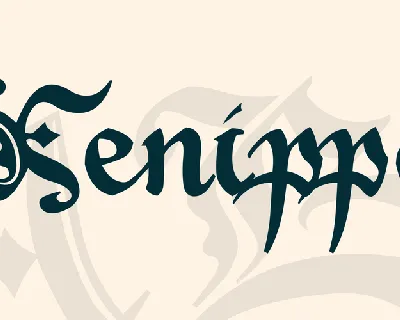
Xenippa font
Download Xenippa font free | Pia Frauss

SonOfTime font
Download SonOfTime font free | Pia Frauss
Comments (0)
Lastest update
Grifter font
Download Grifter font free | Dafont Free
Mildway font
Download Mildway font free | Dafont Free
Halena font
Download Halena font free | Dafont Free
Lacoste Celtic font
Download Lacoste Celtic font free | Dafont Free
Bagnard font
Download Bagnard font free | Dafont Free

Bio Sans font
Download Bio Sans font free | Dafont Free
Berpatu font
Download Berpatu font free | Dafont Free
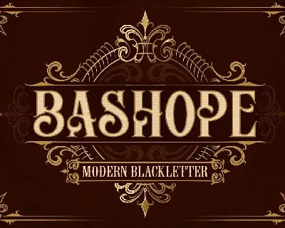
Bashope font
Download Bashope font free | Dafont Free
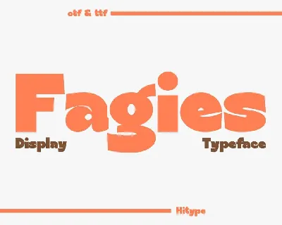
Fagies font
Download Fagies font free | Dafont Free
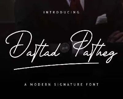
Datlad Patheg font
Download Datlad Patheg font free | Dafont Free