Download free FranciscoLucas font - FLbrsa2U.ttf
About FranciscoLucas font
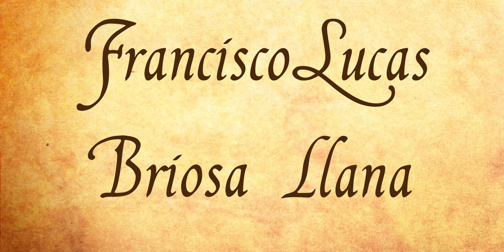
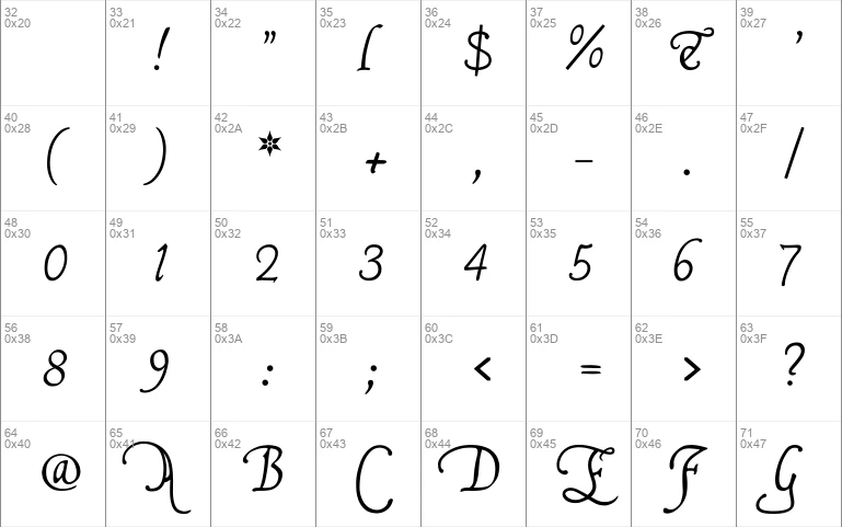
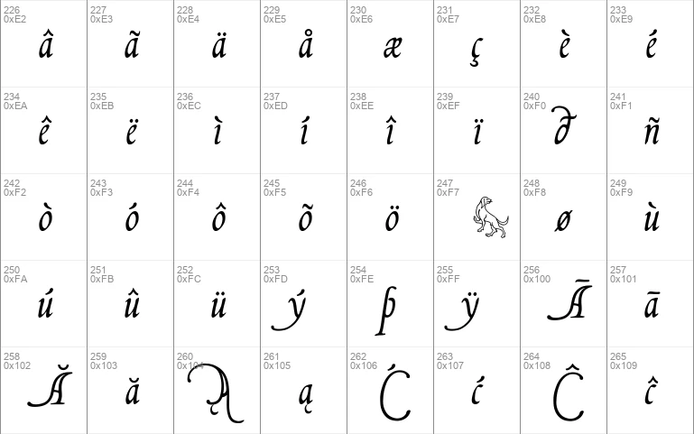
FranciscoLucas Llana was written at Madrid in 1570, by a man called Francisco Lucas. Employing the Spanish term for a cursive hand, he called it a Bastarda; but technically speaking, it is a humanistic cursive -- the style of writing which is mostly known under the name of Chancery. Reworking Mr Lucas' glyphs has been my first attempt to produce something like regularity; and of course, no _K_s and _W_s being needed in Spain, I had to dream them up myself.
FranciscoLucas Briosa is an alternate and more swashed version of FranciscoLucas Llana, designed after an alphabet of capitals created by the same writing master, and in the same year 1570.
Update 2010 has not only enlarged the dashes and redesigned all of the composite glyphs, in both fonts (and corrected the dcaron, Lcaron/lcaron, and tcaron, of course), it has also given FranciscoLucas Llana a new E, W, g, and y. As a consequence, the alternate glyphs, which were formerly the same in both fonts, are now different.
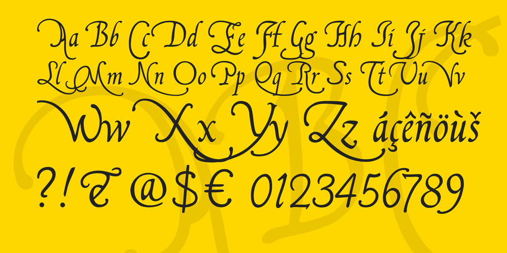
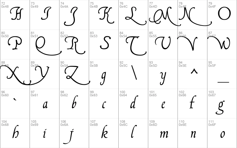
In FranciscoLucas Llana, you'll find the the following alternate glyphs:
- the former g instead of the left bracket
- a plain z instead of the right bracket
- the former E instead of the left curly bracket
- a slender K instead of the right curly bracket
- a slender Z on the bar and broken bar sign.
In FranciscoLucas Briosa, you'll find the the following alternate glyphs:
- a rather condensed g instead of the left bracket
- an alternate y instead of the right bracket
- an alternate E instead of the left curly bracket
- a very swashed R instead of the right curly bracket
- a final e instead of the bar and broken bar sign
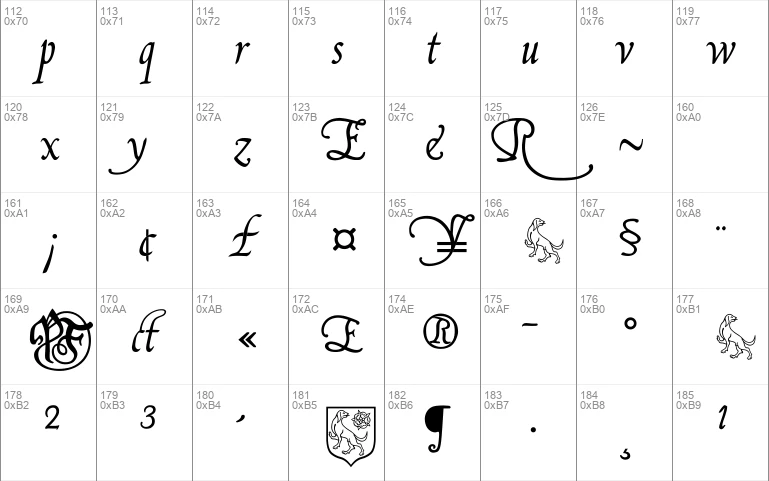
Both fonts have a double long s on the long s sign, as well as a st and a ct ligature on the fi and fl keys (in case the fi and fl signs aren't reachable on your computer, you might try the masculine and feminine ordinal indicators, or the 'less-than or equal to', and the 'greater than or equal to' signs). There is no number sign in these fonts. In its place, you'll find a long s.
Update 2007 had reduced the files' size, by redesigning the composite glyphs, and corrected some flaws -- above all, an error concerning the lcedilla sign.
Download font
Free for Personal Use
This fonts are authors' property, and are either shareware, demo versions or public domain. The licence mentioned above the download button is just an indication. Please look at the readme-files in the archives or check the indicated author's website for details, and contact him if in doubt. If no author/licence is indicated that's because we don't have information, that doesn't mean it's free.
- FLbrsa2U.ttf
FranciscoLucas Briosa Regular | FLbrsa2U.ttf
- Font family: FranciscoLucas Briosa
- Font subfamily identification: Regular
- Unique identifier: FranciscoLucas Briosa:Version 2.00
- Full font name: FranciscoLucas Briosa
- Version: Version 2.00 June 2010, initial release December 2003
- Postscript font name: FranciscoLucasBriosa
- Designer: Pia Frauss
- Description: Francisco Lucas Briosa was created with the Font Creator Program from High-Logic.com
- License: If you want to use this font commercially, please visit http://www.pia-frauss.de/imp/cu.htm
FranciscoLucas Llana Regular | FLllna2U.ttf
- Font family: FranciscoLucas Llana
- Font subfamily identification: Regular
- Unique identifier: FranciscoLucas Llana:Version 2.00
- Full font name: FranciscoLucas Llana
- Version: Version 2.00 June 2010, initial release December 2003
- Postscript font name: FranciscoLucasLlana
- Designer: Pia Frauss
- Description: FranciscoLucas Llana was created with the Font Creator Program from High-Logic.com
- License: If you want to use this font commercially, please visit http://www.pia-frauss.de/imp/cu.htm
FranciscoLucas
FranciscoLucas Briosa & FrancisoLucas Llana (UNICODE)
_____________________________________________
... were created by Pia Frauss in 2003, with High-Logic's FontCreator program. They were updated in 2005 and 2007, set to UNICODE in 2007, and again updated in 2010. You have downloaded version 2.00 of both fonts (first published in 2010).
I hope you'll enjoy these fonts.
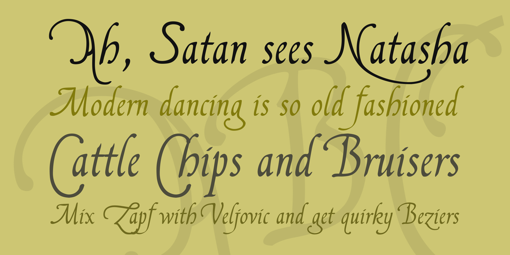
FranciscoLucas Llana is based on a sample text written at Madrid in 1570, by a man called Francisco Lucas. FranciscoLucas Briosa is an alternate and more swashed version of FranciscoLucas Llana, designed after an alphabet of capitals created by the same writing master, and in the same year 1570.
UPDATE 2010 has not only enlarged the dashes and redesigned all of the composite glyphs, in both fonts (and corrected the *dcaron*, *L/lcaron*, and *tcaron*, of course), it has also given FranciscoLucas Llana a new *E*, *W*, *g*, and *y*. As a consequence, the alternate glyphs, which were formerly the same in both fonts, are now different.
In FranciscoLucas Llana, you'll find the the following alternate glyphs:
- the former *g* instead of the left bracket
- a plain *z* instead of the right bracket
- the former *E* instead of the left curly bracket
- a slender *K* instead of the right curly bracket
- a slender *Z* on the bar and broken bar sign.
In FranciscoLucas Briosa, you'll find the the following alternate glyphs:
- a rather condensed *g* instead of the left bracket
- an alternate *y* instead of the right bracket
- an alternate *E* instead of the left curly bracket
- a very swashed *R* instead of the right curly bracket
- a final *e* instead of the bar and broken bar sign
Both fonts have a double *long s* on the long s sign, as well as a *st* and a *ct* ligature on the fi and fl keys (in case the fi and fl signs aren't reachable on your computer, you might try the masculine and feminine ordinal indicators, or the 'less-than or equal to', and the 'greater than or equal to' signs).
There is no number sign in these fonts. In its place, you'll find a long s.
UPDATE 2007 had reduced the files' size, by redesigning the composite glyphs, and corrected some flaws -- above all, an error concerning the lcedilla sign.
_________________________________
Disclaimer:
1. The designer as well as owner of this font is Pia Frauss.
2. This is a free font, but it is restricted to personal use only. Commercial use may be obtained by paying a licensing fee.
3. This font may not be included in any commercial compilation of fonts, be it on CD, disks or other products, without the owner's permission.
4. Altogether, this font may not be used for commercial ends and financial gain without the owner's permission.
5. This font may be freely distributed, as long as the zipfile, including this text, remains unaltered.
6. This font comes as it is. There is no warranty -- express or implied -- offered by the owner, or supplier. The risk of any losses or damages resulting from the use of this font remains wth the user.
If you need any information not supplied by this or by the http://www.pia-frauss.de/ website, please write to fonts @ pia-frauss.de (please remove the spaces around the *@* before copying the address into your mail form).
(However, please note that no enquiries such as "how do I download/install/get such and such program to work with your fonts" will be answered in the future.)
More by Pia Frauss
Jane Austen Signature font
Download Jane Austen Signature font free | Pia Frauss
Xenippa font
Download Xenippa font free | Pia Frauss

SonOfTime font
Download SonOfTime font free | Pia Frauss
Comments (0)
Lastest update
Bio Sans font
Download Bio Sans font free | Dafont Free
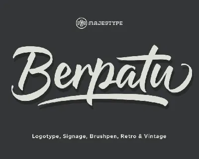
Berpatu font
Download Berpatu font free | Dafont Free
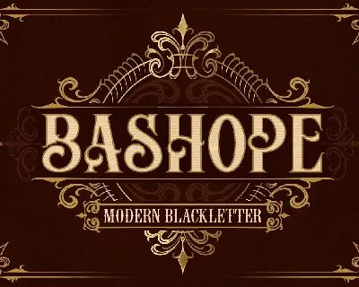
Bashope font
Download Bashope font free | Dafont Free
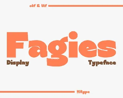
Fagies font
Download Fagies font free | Dafont Free
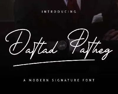
Datlad Patheg font
Download Datlad Patheg font free | Dafont Free
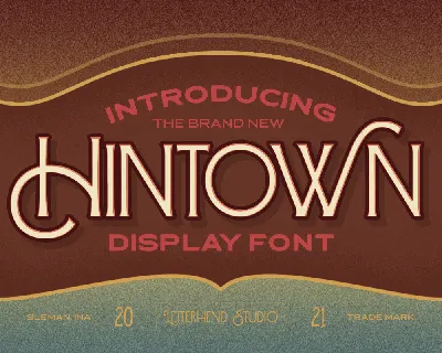
Hintown font
Download Hintown font free | Dafont Free
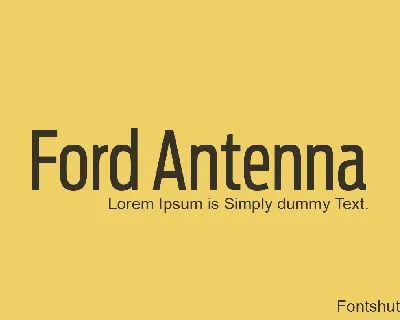
Ford Antenna font
Download Ford Antenna font free | Dafont Free

Cheerios font
Download Cheerios font free | Dafont Free
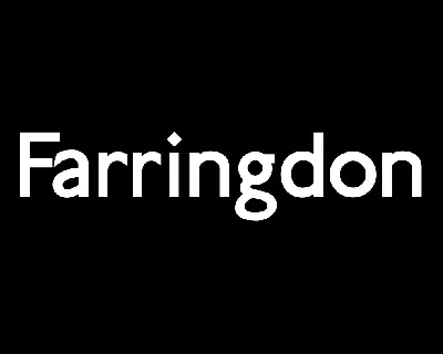
Farringdon font
Download Farringdon font free | Dafont Free
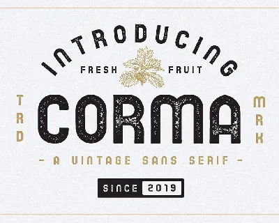
Corma font
Download Corma font free | Dafont Free