Stencil font Mind the Gap
Mind the Gap was born out of the frustration of the love/hate relationship with the London Tube
About Stencil font Mind the Gap
Mind the Gap was born out of the frustration of the love/hate relationship I have of the daily commute.
I'm not sure if it's just a London thing or if it's the same in New York City, Paris, Madrid, Seoul, Shanghai, Beijing, Mexico City, Moscow, Tokyo and Berlin.
It was created by hand cutting letter stencils and spraying them with black paint. This gives it an industrial almost military look and feel.
It's deliberately not perfect I wanted it to be dirty so it looks more real and has a bit of personality.
It includes one stylistic alternative for uppercase and lowercase A-Z. Plus an additional stylistic alternative for A,B,D,O,P,Q,R and a,b,d,e,g,o,p,q and three alternatives for numbers.
That means is you can change out repeated glyphs with alternatives.
Includes
- One weight
- Uppercase and Lowercase
- Numbers
- Punctuation & Symbols
- Stylistic sets
- Western European characters
- Central European characters
- South Eastern European characters
- OTF
Similar fonts
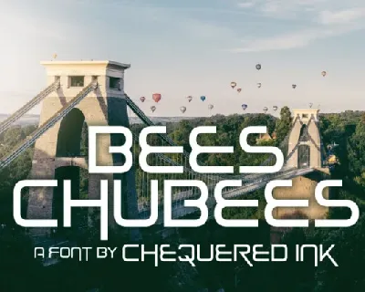
Bees Chubees font
Download Bees Chubees font free | Chequered Ink
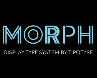
Morph Family font
Download Morph Family font free | TipoType
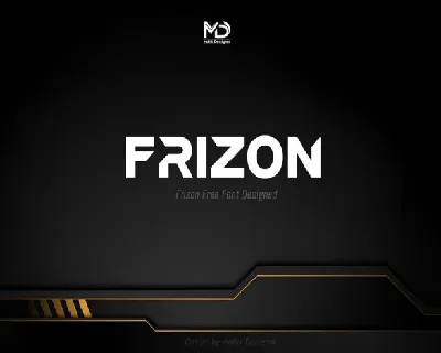
Frizon font
Download Frizon font free | Mohit Designer
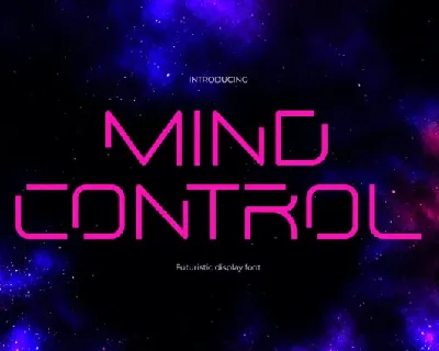
Mind Control font
Download Mind Control font free | Just The Skills
Roktone font
Download Roktone font free | Ardyanatypes
Saint And Social font
Download Saint And Social font free | ForzaType

Aviarge font
Download Aviarge font free | RantauType
CS Hovan Mono font
Download CS Hovan Mono font free | Craft Supply Co
Noxlock font
Download Noxlock font free | sentype