Font CategoriesSans Serif

Download free Optima Family font - OptimaLTPro-Black.otf

(0 vote)
Download free Optima Family font by Dafont Free free for Personal Use. Font list: OptimaLTPro-Black.otf, OptimaLTPro-BlackItalic.otf, OptimaLTPro-Bold.otf, OptimaLTPro-BoldItalic.otf, OptimaLTPro-DemiBold.otf, OptimaLTPro-DemiBoldItalic.otf, OptimaLTPro-ExtraBlack.otf, OptimaLTPro-ExtraBlackIta.otf, OptimaLTPro-Italic.otf, OptimaLTPro-Medium.otf, OptimaLTPro-MediumItalic.otf, OptimaLTPro-Roman.otf,
  • Optima Family font
  • Optima Family font
  • Optima Family font

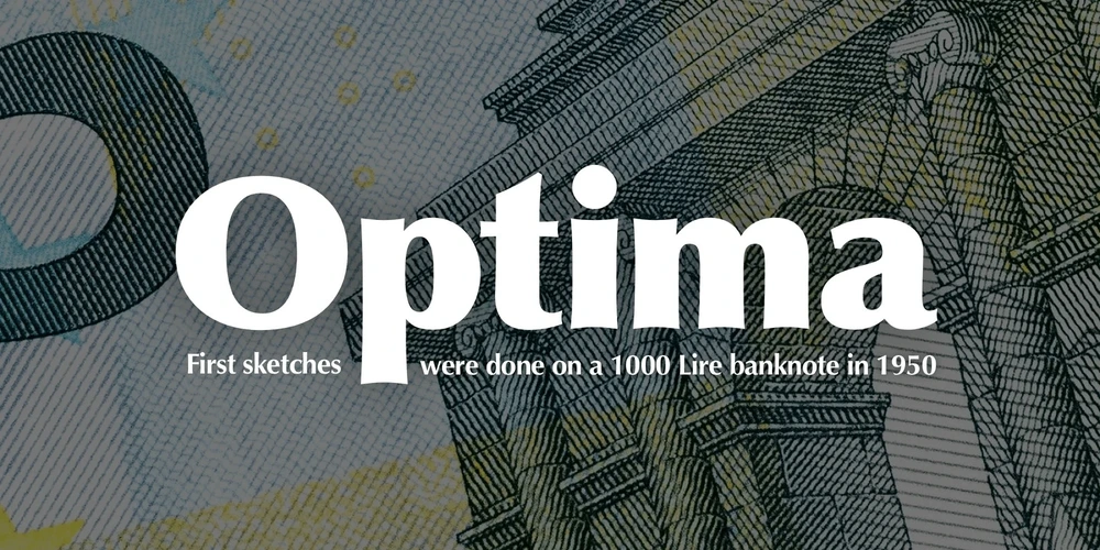
Many typefaces are distinctive or attractive at the expense of legibility and versatility. Not so the Optima® family. Simultaneously standing out and fitting in, there are few projects or imaging environments outside of its range. Although Optima is almost always grouped with sans serif typefaces, it should be considered a serifless roman.

True to its Roman heritage, Optima has wide, full-bodied characters – especially in the capitals. Only the E, F and L deviate with narrow forms. Consistent with other Zapf designs, the cap S in Optima appears slightly top-heavy with a slight tilt to the right. The M is splayed, and the N, like a serif design, has light vertical strokes. The lowercase a and g in Optima are high-legibility two-storied designs.

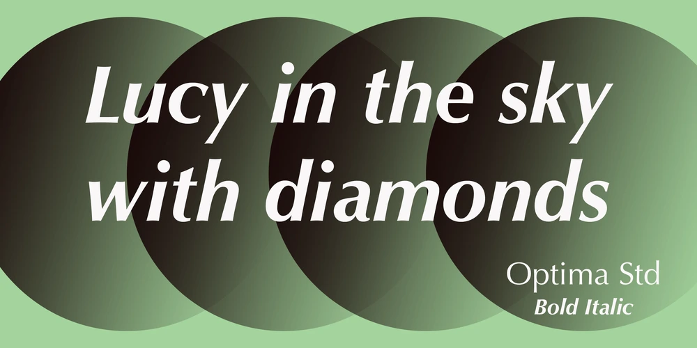
Optima can be set within a wide choice of line spacing values – from very tight to very open. In fact, there are few limits to the amount of white space that can be added between lines of text. Optima also benefits from a wide range of letter spacing capability. It can be set quite tight, or even slightly open – especially the capitals. If there are any guidelines, Optima should be set more open than tight. It’s not that readability is affected that much when Optima is set on the snug side; it’s just that the unhurried elegance and light gray typographic color created by the face are disrupted when letters are set too tight. Optima is also about as gregarious as a typeface can be. It mixes well with virtually any serif design and a surprisingly large number of sans serif faces.

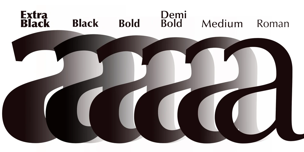
The Optima family is available in six weights, from roman to extra black, each with an italic counterpart. In addition, the family is available as a suite of OpenType® Pro fonts, providing for the automatic insertion of small caps, ligatures and alternate characters, in addition to offering an extended character set supporting most Central European and many Eastern European languages.

When you’re ready to find its perfect pairing, browse these fantastic matches: Monotype Century Old Style™, Dante®, Frutiger® Serif, Joanna® Nova, Malabar™ and Soho®.

This font is free for PERSONAL USE. Link to purchase full version and commercial license : BUY HERE

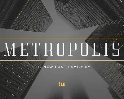
Optima Serif Font Family

Download font

Free for Personal Use

This fonts are authors' property, and are either shareware, demo versions or public domain. The licence mentioned above the download button is just an indication. Please look at the readme-files in the archives or check the indicated author's website for details, and contact him if in doubt. If no author/licence is indicated that's because we don't have information, that doesn't mean it's free.

AA Aa aa
  • OptimaLTPro-Black.otf
    Optima LT Pro Black font - OptimaLTPro-Black.otf
  • OptimaLTPro-BlackItalic.otf
    Optima LT Pro Black Italic font - OptimaLTPro-BlackItalic.otf
  • OptimaLTPro-Bold.otf
    Optima LT Pro Bold font - OptimaLTPro-Bold.otf
  • OptimaLTPro-BoldItalic.otf
    Optima LT Pro Bold Italic font - OptimaLTPro-BoldItalic.otf
  • OptimaLTPro-DemiBold.otf
    Optima LT Pro Demi Bold font - OptimaLTPro-DemiBold.otf
  • OptimaLTPro-DemiBoldItalic.otf
    Optima LT Pro Demi Bold Italic font - OptimaLTPro-DemiBoldItalic.otf
  • OptimaLTPro-ExtraBlack.otf
    Optima LT Pro Extra Black font - OptimaLTPro-ExtraBlack.otf
  • OptimaLTPro-ExtraBlackIta.otf
    Optima LT Pro Extra Black Italic font - OptimaLTPro-ExtraBlackIta.otf
  • OptimaLTPro-Italic.otf
    Optima LT Pro Italic font - OptimaLTPro-Italic.otf
  • OptimaLTPro-Medium.otf
    Optima LT Pro Medium font - OptimaLTPro-Medium.otf
  • OptimaLTPro-MediumItalic.otf
    Optima LT Pro Medium Italic font - OptimaLTPro-MediumItalic.otf
  • OptimaLTPro-Roman.otf
    Optima LT Pro Roman font - OptimaLTPro-Roman.otf

Optima LT Pro Black | OptimaLTPro-Black.otf

  • Font family: Optima LT Pro
  • Font subfamily identification: Black
  • Unique identifier: Monotype Imaging Inc.:Optima LT Pro Black:2014
  • Full font name: Optima LT Pro Black
  • Version: Version 2.000 Build 1000
  • Postscript font name: OptimaLTPro-Black
  • Trademark notice: Optima is a trademark of Monotype Imaging Inc. registered in the U.S. Patent and Trademark Office and may be registered in certain other jurisdictions.
  • Manufacturer name: Monotype Imaging Inc.
  • Designer: Hermann Zapf
  • Description: Optima was designed by Hermann Zapf and is his most successful typeface. In 1950, Zapf made his first sketches while visiting the Santa Croce church in Florence. He sketched letters from grave plates that had been cut about 1530, and as he had no other paper with him at the time, the sketches were done on two 1000 lire bank notes. These letters from the floor of the church inspired Optima, a typeface that is classically roman in proportion and character, but without serifs. The letterforms were designed in the proportions of the Golden Ratio. In 1952, after careful legibility testing, the first drawings were finished. The type was cut by the famous punchcutter August Rosenberger at the D. Stempel AG typefoundry in Frankfurt. Optima was produced in matrices for the Linotype typesetting machines and released in 1958. With the clear, simple elegance of its sans serif forms and the warmly human touches of its tapering stems, this family has proved popular around the world. Optima is an all-purpose typeface; it works for just about anything from book text to signage. It is available in 12 weights and 4 companion fonts with Central European characters and accents. In 2002, more than 50 years after the first sketches, Hermann Zapf and Akira Kobayashi completed Optima nova, an expansion and redesign of the Optima family.
  • License: This font software is the property of Monotype Imaging Inc., or one of its affiliated entities (collectively, Monotype) and its use by you is covered under the terms of a license agreement. You have obtained this font software either directly from Monotype or together with software distributed by one of the licensees of Monotype. This software is a valuable asset of Monotype. Unless you have entered into a specific license agreement granting you additional rights, your use of this software is limited by the terms of the actual license agreement you have entered into with Monotype. You may not copy or distribute this software. If you have any questions concerning your rights you should review the license agreement you received with the software. You can learn more about Monotype here: www.monotype.com

Optima LT Pro Black Italic | OptimaLTPro-BlackItalic.otf

  • Font family: Optima LT Pro
  • Font subfamily identification: Black Italic
  • Unique identifier: Monotype Imaging Inc.:Optima LT Pro Black Italic:2014
  • Full font name: Optima LT Pro Black Italic
  • Version: Version 2.000 Build 1000
  • Postscript font name: OptimaLTPro-BlackItalic
  • Trademark notice: Optima is a trademark of Monotype Imaging Inc. registered in the U.S. Patent and Trademark Office and may be registered in certain other jurisdictions.
  • Manufacturer name: Monotype Imaging Inc.
  • Designer: Hermann Zapf
  • Description: Optima was designed by Hermann Zapf and is his most successful typeface. In 1950, Zapf made his first sketches while visiting the Santa Croce church in Florence. He sketched letters from grave plates that had been cut about 1530, and as he had no other paper with him at the time, the sketches were done on two 1000 lire bank notes. These letters from the floor of the church inspired Optima, a typeface that is classically roman in proportion and character, but without serifs. The letterforms were designed in the proportions of the Golden Ratio. In 1952, after careful legibility testing, the first drawings were finished. The type was cut by the famous punchcutter August Rosenberger at the D. Stempel AG typefoundry in Frankfurt. Optima was produced in matrices for the Linotype typesetting machines and released in 1958. With the clear, simple elegance of its sans serif forms and the warmly human touches of its tapering stems, this family has proved popular around the world. Optima is an all-purpose typeface; it works for just about anything from book text to signage. It is available in 12 weights and 4 companion fonts with Central European characters and accents. In 2002, more than 50 years after the first sketches, Hermann Zapf and Akira Kobayashi completed Optima nova, an expansion and redesign of the Optima family.
  • License: This font software is the property of Monotype Imaging Inc., or one of its affiliated entities (collectively, Monotype) and its use by you is covered under the terms of a license agreement. You have obtained this font software either directly from Monotype or together with software distributed by one of the licensees of Monotype. This software is a valuable asset of Monotype. Unless you have entered into a specific license agreement granting you additional rights, your use of this software is limited by the terms of the actual license agreement you have entered into with Monotype. You may not copy or distribute this software. If you have any questions concerning your rights you should review the license agreement you received with the software. You can learn more about Monotype here: www.monotype.com

Optima LT Pro Bold | OptimaLTPro-Bold.otf

  • Font family: Optima LT Pro
  • Font subfamily identification: Bold
  • Unique identifier: Monotype Imaging Inc.:Optima LT Pro Bold:2014
  • Full font name: Optima LT Pro Bold
  • Version: Version 2.000 Build 1000
  • Postscript font name: OptimaLTPro-Bold
  • Trademark notice: Optima is a trademark of Monotype Imaging Inc. registered in the U.S. Patent and Trademark Office and may be registered in certain other jurisdictions.
  • Manufacturer name: Monotype Imaging Inc.
  • Designer: Hermann Zapf
  • Description: Optima was designed by Hermann Zapf and is his most successful typeface. In 1950, Zapf made his first sketches while visiting the Santa Croce church in Florence. He sketched letters from grave plates that had been cut about 1530, and as he had no other paper with him at the time, the sketches were done on two 1000 lire bank notes. These letters from the floor of the church inspired Optima, a typeface that is classically roman in proportion and character, but without serifs. The letterforms were designed in the proportions of the Golden Ratio. In 1952, after careful legibility testing, the first drawings were finished. The type was cut by the famous punchcutter August Rosenberger at the D. Stempel AG typefoundry in Frankfurt. Optima was produced in matrices for the Linotype typesetting machines and released in 1958. With the clear, simple elegance of its sans serif forms and the warmly human touches of its tapering stems, this family has proved popular around the world. Optima is an all-purpose typeface; it works for just about anything from book text to signage. It is available in 12 weights and 4 companion fonts with Central European characters and accents. In 2002, more than 50 years after the first sketches, Hermann Zapf and Akira Kobayashi completed Optima nova, an expansion and redesign of the Optima family.
  • License: This font software is the property of Monotype Imaging Inc., or one of its affiliated entities (collectively, Monotype) and its use by you is covered under the terms of a license agreement. You have obtained this font software either directly from Monotype or together with software distributed by one of the licensees of Monotype. This software is a valuable asset of Monotype. Unless you have entered into a specific license agreement granting you additional rights, your use of this software is limited by the terms of the actual license agreement you have entered into with Monotype. You may not copy or distribute this software. If you have any questions concerning your rights you should review the license agreement you received with the software. You can learn more about Monotype here: www.monotype.com

Optima LT Pro Bold Italic | OptimaLTPro-BoldItalic.otf

  • Font family: Optima LT Pro
  • Font subfamily identification: Bold Italic
  • Unique identifier: Monotype Imaging Inc.:Optima LT Pro Bold Italic:2014
  • Full font name: Optima LT Pro Bold Italic
  • Version: Version 2.000 Build 1000
  • Postscript font name: OptimaLTPro-BoldItalic
  • Trademark notice: Optima is a trademark of Monotype Imaging Inc. registered in the U.S. Patent and Trademark Office and may be registered in certain other jurisdictions.
  • Manufacturer name: Monotype Imaging Inc.
  • Designer: Hermann Zapf
  • Description: Optima was designed by Hermann Zapf and is his most successful typeface. In 1950, Zapf made his first sketches while visiting the Santa Croce church in Florence. He sketched letters from grave plates that had been cut about 1530, and as he had no other paper with him at the time, the sketches were done on two 1000 lire bank notes. These letters from the floor of the church inspired Optima, a typeface that is classically roman in proportion and character, but without serifs. The letterforms were designed in the proportions of the Golden Ratio. In 1952, after careful legibility testing, the first drawings were finished. The type was cut by the famous punchcutter August Rosenberger at the D. Stempel AG typefoundry in Frankfurt. Optima was produced in matrices for the Linotype typesetting machines and released in 1958. With the clear, simple elegance of its sans serif forms and the warmly human touches of its tapering stems, this family has proved popular around the world. Optima is an all-purpose typeface; it works for just about anything from book text to signage. It is available in 12 weights and 4 companion fonts with Central European characters and accents. In 2002, more than 50 years after the first sketches, Hermann Zapf and Akira Kobayashi completed Optima nova, an expansion and redesign of the Optima family.
  • License: This font software is the property of Monotype Imaging Inc., or one of its affiliated entities (collectively, Monotype) and its use by you is covered under the terms of a license agreement. You have obtained this font software either directly from Monotype or together with software distributed by one of the licensees of Monotype. This software is a valuable asset of Monotype. Unless you have entered into a specific license agreement granting you additional rights, your use of this software is limited by the terms of the actual license agreement you have entered into with Monotype. You may not copy or distribute this software. If you have any questions concerning your rights you should review the license agreement you received with the software. You can learn more about Monotype here: www.monotype.com

Optima LT Pro Demi Bold | OptimaLTPro-DemiBold.otf

  • Font family: Optima LT Pro
  • Font subfamily identification: Demi Bold
  • Unique identifier: Monotype Imaging Inc.:Optima LT Pro Demi Bold:2014
  • Full font name: Optima LT Pro Demi Bold
  • Version: Version 2.000 Build 1000
  • Postscript font name: OptimaLTPro-DemiBold
  • Trademark notice: Optima is a trademark of Monotype Imaging Inc. registered in the U.S. Patent and Trademark Office and may be registered in certain other jurisdictions.
  • Manufacturer name: Monotype Imaging Inc.
  • Designer: Hermann Zapf
  • Description: Optima was designed by Hermann Zapf and is his most successful typeface. In 1950, Zapf made his first sketches while visiting the Santa Croce church in Florence. He sketched letters from grave plates that had been cut about 1530, and as he had no other paper with him at the time, the sketches were done on two 1000 lire bank notes. These letters from the floor of the church inspired Optima, a typeface that is classically roman in proportion and character, but without serifs. The letterforms were designed in the proportions of the Golden Ratio. In 1952, after careful legibility testing, the first drawings were finished. The type was cut by the famous punchcutter August Rosenberger at the D. Stempel AG typefoundry in Frankfurt. Optima was produced in matrices for the Linotype typesetting machines and released in 1958. With the clear, simple elegance of its sans serif forms and the warmly human touches of its tapering stems, this family has proved popular around the world. Optima is an all-purpose typeface; it works for just about anything from book text to signage. It is available in 12 weights and 4 companion fonts with Central European characters and accents. In 2002, more than 50 years after the first sketches, Hermann Zapf and Akira Kobayashi completed Optima nova, an expansion and redesign of the Optima family.
  • License: This font software is the property of Monotype Imaging Inc., or one of its affiliated entities (collectively, Monotype) and its use by you is covered under the terms of a license agreement. You have obtained this font software either directly from Monotype or together with software distributed by one of the licensees of Monotype. This software is a valuable asset of Monotype. Unless you have entered into a specific license agreement granting you additional rights, your use of this software is limited by the terms of the actual license agreement you have entered into with Monotype. You may not copy or distribute this software. If you have any questions concerning your rights you should review the license agreement you received with the software. You can learn more about Monotype here: www.monotype.com

Optima LT Pro Demi Bold Italic | OptimaLTPro-DemiBoldItalic.otf

  • Font family: Optima LT Pro
  • Font subfamily identification: Demi Bold Italic
  • Unique identifier: Monotype Imaging Inc.:Optima LT Pro Demi Bold Italic:2014
  • Full font name: Optima LT Pro Demi Bold Italic
  • Version: Version 2.000 Build 1000
  • Postscript font name: OptimaLTPro-DemiBoldItalic
  • Trademark notice: Optima is a trademark of Monotype Imaging Inc. registered in the U.S. Patent and Trademark Office and may be registered in certain other jurisdictions.
  • Manufacturer name: Monotype Imaging Inc.
  • Designer: Hermann Zapf
  • Description: Optima was designed by Hermann Zapf and is his most successful typeface. In 1950, Zapf made his first sketches while visiting the Santa Croce church in Florence. He sketched letters from grave plates that had been cut about 1530, and as he had no other paper with him at the time, the sketches were done on two 1000 lire bank notes. These letters from the floor of the church inspired Optima, a typeface that is classically roman in proportion and character, but without serifs. The letterforms were designed in the proportions of the Golden Ratio. In 1952, after careful legibility testing, the first drawings were finished. The type was cut by the famous punchcutter August Rosenberger at the D. Stempel AG typefoundry in Frankfurt. Optima was produced in matrices for the Linotype typesetting machines and released in 1958. With the clear, simple elegance of its sans serif forms and the warmly human touches of its tapering stems, this family has proved popular around the world. Optima is an all-purpose typeface; it works for just about anything from book text to signage. It is available in 12 weights and 4 companion fonts with Central European characters and accents. In 2002, more than 50 years after the first sketches, Hermann Zapf and Akira Kobayashi completed Optima nova, an expansion and redesign of the Optima family.
  • License: This font software is the property of Monotype Imaging Inc., or one of its affiliated entities (collectively, Monotype) and its use by you is covered under the terms of a license agreement. You have obtained this font software either directly from Monotype or together with software distributed by one of the licensees of Monotype. This software is a valuable asset of Monotype. Unless you have entered into a specific license agreement granting you additional rights, your use of this software is limited by the terms of the actual license agreement you have entered into with Monotype. You may not copy or distribute this software. If you have any questions concerning your rights you should review the license agreement you received with the software. You can learn more about Monotype here: www.monotype.com

Optima LT Pro Extra Black | OptimaLTPro-ExtraBlack.otf

  • Font family: Optima LT Pro
  • Font subfamily identification: Extra Black
  • Unique identifier: Monotype Imaging Inc.:Optima LT Pro Extra Black:2014
  • Full font name: Optima LT Pro Extra Black
  • Version: Version 2.000 Build 1000
  • Postscript font name: OptimaLTPro-ExtraBlack
  • Trademark notice: Optima is a trademark of Monotype Imaging Inc. registered in the U.S. Patent and Trademark Office and may be registered in certain other jurisdictions.
  • Manufacturer name: Monotype Imaging Inc.
  • Designer: Hermann Zapf
  • Description: Optima was designed by Hermann Zapf and is his most successful typeface. In 1950, Zapf made his first sketches while visiting the Santa Croce church in Florence. He sketched letters from grave plates that had been cut about 1530, and as he had no other paper with him at the time, the sketches were done on two 1000 lire bank notes. These letters from the floor of the church inspired Optima, a typeface that is classically roman in proportion and character, but without serifs. The letterforms were designed in the proportions of the Golden Ratio. In 1952, after careful legibility testing, the first drawings were finished. The type was cut by the famous punchcutter August Rosenberger at the D. Stempel AG typefoundry in Frankfurt. Optima was produced in matrices for the Linotype typesetting machines and released in 1958. With the clear, simple elegance of its sans serif forms and the warmly human touches of its tapering stems, this family has proved popular around the world. Optima is an all-purpose typeface; it works for just about anything from book text to signage. It is available in 12 weights and 4 companion fonts with Central European characters and accents. In 2002, more than 50 years after the first sketches, Hermann Zapf and Akira Kobayashi completed Optima nova, an expansion and redesign of the Optima family.
  • License: This font software is the property of Monotype Imaging Inc., or one of its affiliated entities (collectively, Monotype) and its use by you is covered under the terms of a license agreement. You have obtained this font software either directly from Monotype or together with software distributed by one of the licensees of Monotype. This software is a valuable asset of Monotype. Unless you have entered into a specific license agreement granting you additional rights, your use of this software is limited by the terms of the actual license agreement you have entered into with Monotype. You may not copy or distribute this software. If you have any questions concerning your rights you should review the license agreement you received with the software. You can learn more about Monotype here: www.monotype.com

Optima LT Pro Extra Black Italic | OptimaLTPro-ExtraBlackIta.otf

  • Font family: Optima LT Pro
  • Font subfamily identification: Extra Black Italic
  • Unique identifier: Monotype Imaging Inc.:Optima LT Pro Extra Black Italic:2014
  • Full font name: Optima LT Pro Extra Black Italic
  • Version: Version 2.000 Build 1000
  • Postscript font name: OptimaLTPro-ExtraBlackIta
  • Trademark notice: Optima is a trademark of Monotype Imaging Inc. registered in the U.S. Patent and Trademark Office and may be registered in certain other jurisdictions.
  • Manufacturer name: Monotype Imaging Inc.
  • Designer: Hermann Zapf
  • Description: Optima was designed by Hermann Zapf and is his most successful typeface. In 1950, Zapf made his first sketches while visiting the Santa Croce church in Florence. He sketched letters from grave plates that had been cut about 1530, and as he had no other paper with him at the time, the sketches were done on two 1000 lire bank notes. These letters from the floor of the church inspired Optima, a typeface that is classically roman in proportion and character, but without serifs. The letterforms were designed in the proportions of the Golden Ratio. In 1952, after careful legibility testing, the first drawings were finished. The type was cut by the famous punchcutter August Rosenberger at the D. Stempel AG typefoundry in Frankfurt. Optima was produced in matrices for the Linotype typesetting machines and released in 1958. With the clear, simple elegance of its sans serif forms and the warmly human touches of its tapering stems, this family has proved popular around the world. Optima is an all-purpose typeface; it works for just about anything from book text to signage. It is available in 12 weights and 4 companion fonts with Central European characters and accents. In 2002, more than 50 years after the first sketches, Hermann Zapf and Akira Kobayashi completed Optima nova, an expansion and redesign of the Optima family.
  • License: This font software is the property of Monotype Imaging Inc., or one of its affiliated entities (collectively, Monotype) and its use by you is covered under the terms of a license agreement. You have obtained this font software either directly from Monotype or together with software distributed by one of the licensees of Monotype. This software is a valuable asset of Monotype. Unless you have entered into a specific license agreement granting you additional rights, your use of this software is limited by the terms of the actual license agreement you have entered into with Monotype. You may not copy or distribute this software. If you have any questions concerning your rights you should review the license agreement you received with the software. You can learn more about Monotype here: www.monotype.com

Optima LT Pro Italic | OptimaLTPro-Italic.otf

  • Font family: Optima LT Pro
  • Font subfamily identification: Italic
  • Unique identifier: Monotype Imaging Inc.:Optima LT Pro Italic:2014
  • Full font name: Optima LT Pro Italic
  • Version: Version 2.000 Build 1000
  • Postscript font name: OptimaLTPro-Italic
  • Trademark notice: Optima is a trademark of Monotype Imaging Inc. registered in the U.S. Patent and Trademark Office and may be registered in certain other jurisdictions.
  • Manufacturer name: Monotype Imaging Inc.
  • Designer: Hermann Zapf
  • Description: Optima was designed by Hermann Zapf and is his most successful typeface. In 1950, Zapf made his first sketches while visiting the Santa Croce church in Florence. He sketched letters from grave plates that had been cut about 1530, and as he had no other paper with him at the time, the sketches were done on two 1000 lire bank notes. These letters from the floor of the church inspired Optima, a typeface that is classically roman in proportion and character, but without serifs. The letterforms were designed in the proportions of the Golden Ratio. In 1952, after careful legibility testing, the first drawings were finished. The type was cut by the famous punchcutter August Rosenberger at the D. Stempel AG typefoundry in Frankfurt. Optima was produced in matrices for the Linotype typesetting machines and released in 1958. With the clear, simple elegance of its sans serif forms and the warmly human touches of its tapering stems, this family has proved popular around the world. Optima is an all-purpose typeface; it works for just about anything from book text to signage. It is available in 12 weights and 4 companion fonts with Central European characters and accents. In 2002, more than 50 years after the first sketches, Hermann Zapf and Akira Kobayashi completed Optima nova, an expansion and redesign of the Optima family.
  • License: This font software is the property of Monotype Imaging Inc., or one of its affiliated entities (collectively, Monotype) and its use by you is covered under the terms of a license agreement. You have obtained this font software either directly from Monotype or together with software distributed by one of the licensees of Monotype. This software is a valuable asset of Monotype. Unless you have entered into a specific license agreement granting you additional rights, your use of this software is limited by the terms of the actual license agreement you have entered into with Monotype. You may not copy or distribute this software. If you have any questions concerning your rights you should review the license agreement you received with the software. You can learn more about Monotype here: www.monotype.com

Optima LT Pro Medium | OptimaLTPro-Medium.otf

  • Font family: Optima LT Pro
  • Font subfamily identification: Medium
  • Unique identifier: Monotype Imaging Inc.:Optima LT Pro Medium:2014
  • Full font name: Optima LT Pro Medium
  • Version: Version 2.000 Build 1000
  • Postscript font name: OptimaLTPro-Medium
  • Trademark notice: Optima is a trademark of Monotype Imaging Inc. registered in the U.S. Patent and Trademark Office and may be registered in certain other jurisdictions.
  • Manufacturer name: Monotype Imaging Inc.
  • Designer: Hermann Zapf
  • Description: Optima was designed by Hermann Zapf and is his most successful typeface. In 1950, Zapf made his first sketches while visiting the Santa Croce church in Florence. He sketched letters from grave plates that had been cut about 1530, and as he had no other paper with him at the time, the sketches were done on two 1000 lire bank notes. These letters from the floor of the church inspired Optima, a typeface that is classically roman in proportion and character, but without serifs. The letterforms were designed in the proportions of the Golden Ratio. In 1952, after careful legibility testing, the first drawings were finished. The type was cut by the famous punchcutter August Rosenberger at the D. Stempel AG typefoundry in Frankfurt. Optima was produced in matrices for the Linotype typesetting machines and released in 1958. With the clear, simple elegance of its sans serif forms and the warmly human touches of its tapering stems, this family has proved popular around the world. Optima is an all-purpose typeface; it works for just about anything from book text to signage. It is available in 12 weights and 4 companion fonts with Central European characters and accents. In 2002, more than 50 years after the first sketches, Hermann Zapf and Akira Kobayashi completed Optima nova, an expansion and redesign of the Optima family.
  • License: This font software is the property of Monotype Imaging Inc., or one of its affiliated entities (collectively, Monotype) and its use by you is covered under the terms of a license agreement. You have obtained this font software either directly from Monotype or together with software distributed by one of the licensees of Monotype. This software is a valuable asset of Monotype. Unless you have entered into a specific license agreement granting you additional rights, your use of this software is limited by the terms of the actual license agreement you have entered into with Monotype. You may not copy or distribute this software. If you have any questions concerning your rights you should review the license agreement you received with the software. You can learn more about Monotype here: www.monotype.com

Optima LT Pro Medium Italic | OptimaLTPro-MediumItalic.otf

  • Font family: Optima LT Pro
  • Font subfamily identification: Medium Italic
  • Unique identifier: Monotype Imaging Inc.:Optima LT Pro Medium Italic:2014
  • Full font name: Optima LT Pro Medium Italic
  • Version: Version 2.000 Build 1000
  • Postscript font name: OptimaLTPro-MediumItalic
  • Trademark notice: Optima is a trademark of Monotype Imaging Inc. registered in the U.S. Patent and Trademark Office and may be registered in certain other jurisdictions.
  • Manufacturer name: Monotype Imaging Inc.
  • Designer: Hermann Zapf
  • Description: Optima was designed by Hermann Zapf and is his most successful typeface. In 1950, Zapf made his first sketches while visiting the Santa Croce church in Florence. He sketched letters from grave plates that had been cut about 1530, and as he had no other paper with him at the time, the sketches were done on two 1000 lire bank notes. These letters from the floor of the church inspired Optima, a typeface that is classically roman in proportion and character, but without serifs. The letterforms were designed in the proportions of the Golden Ratio. In 1952, after careful legibility testing, the first drawings were finished. The type was cut by the famous punchcutter August Rosenberger at the D. Stempel AG typefoundry in Frankfurt. Optima was produced in matrices for the Linotype typesetting machines and released in 1958. With the clear, simple elegance of its sans serif forms and the warmly human touches of its tapering stems, this family has proved popular around the world. Optima is an all-purpose typeface; it works for just about anything from book text to signage. It is available in 12 weights and 4 companion fonts with Central European characters and accents. In 2002, more than 50 years after the first sketches, Hermann Zapf and Akira Kobayashi completed Optima nova, an expansion and redesign of the Optima family.
  • License: This font software is the property of Monotype Imaging Inc., or one of its affiliated entities (collectively, Monotype) and its use by you is covered under the terms of a license agreement. You have obtained this font software either directly from Monotype or together with software distributed by one of the licensees of Monotype. This software is a valuable asset of Monotype. Unless you have entered into a specific license agreement granting you additional rights, your use of this software is limited by the terms of the actual license agreement you have entered into with Monotype. You may not copy or distribute this software. If you have any questions concerning your rights you should review the license agreement you received with the software. You can learn more about Monotype here: www.monotype.com

Optima LT Pro Roman | OptimaLTPro-Roman.otf

  • Font family: Optima LT Pro
  • Font subfamily identification: Roman
  • Unique identifier: Monotype Imaging Inc.:Optima LT Pro Roman:2014
  • Full font name: Optima LT Pro Roman
  • Version: Version 2.000 Build 1000
  • Postscript font name: OptimaLTPro-Roman
  • Trademark notice: Optima is a trademark of Monotype Imaging Inc. registered in the U.S. Patent and Trademark Office and may be registered in certain other jurisdictions.
  • Manufacturer name: Monotype Imaging Inc.
  • Designer: Hermann Zapf
  • Description: Optima was designed by Hermann Zapf and is his most successful typeface. In 1950, Zapf made his first sketches while visiting the Santa Croce church in Florence. He sketched letters from grave plates that had been cut about 1530, and as he had no other paper with him at the time, the sketches were done on two 1000 lire bank notes. These letters from the floor of the church inspired Optima, a typeface that is classically roman in proportion and character, but without serifs. The letterforms were designed in the proportions of the Golden Ratio. In 1952, after careful legibility testing, the first drawings were finished. The type was cut by the famous punchcutter August Rosenberger at the D. Stempel AG typefoundry in Frankfurt. Optima was produced in matrices for the Linotype typesetting machines and released in 1958. With the clear, simple elegance of its sans serif forms and the warmly human touches of its tapering stems, this family has proved popular around the world. Optima is an all-purpose typeface; it works for just about anything from book text to signage. It is available in 12 weights and 4 companion fonts with Central European characters and accents. In 2002, more than 50 years after the first sketches, Hermann Zapf and Akira Kobayashi completed Optima nova, an expansion and redesign of the Optima family.
  • License: This font software is the property of Monotype Imaging Inc., or one of its affiliated entities (collectively, Monotype) and its use by you is covered under the terms of a license agreement. You have obtained this font software either directly from Monotype or together with software distributed by one of the licensees of Monotype. This software is a valuable asset of Monotype. Unless you have entered into a specific license agreement granting you additional rights, your use of this software is limited by the terms of the actual license agreement you have entered into with Monotype. You may not copy or distribute this software. If you have any questions concerning your rights you should review the license agreement you received with the software. You can learn more about Monotype here: www.monotype.com

More by Dafont Free

Comments (0)

no-avatar
Please login!

    Lastest update