Download free MitreSquare font - MitreSqu_U.ttf
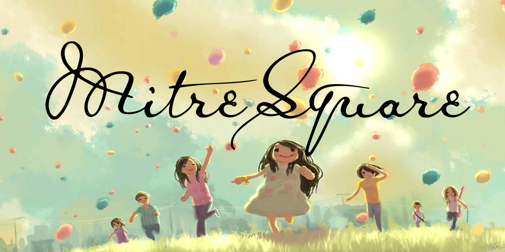
About MitreSquare font
This rather dainty font has a rather sinister background — i.e., the murder of Catherine Eddowes by the serial killer called JackTheRipper, on September 30, 1888, at London Mitre Square. One month later, on 27th October 1888, a police inspector by the name of Jason McWilliam wrote a report concerning the events of that night. Shortly afterwards, someone whose name is not on record, made a copy of Inspector Mc William’s report, which copy got its Home Office stamp on “29 OCT 88”.
Luckily, this copy has come upon us, and a facsimile of it is included in that fascinating folder “Jack the Ripper and the Whitechapel murders. The true story through contemporary documents”, edited by Stewart P Evans and Keith Skinner (Public Record Office/The National Archives). At least, for my part, I was fascinated by the discovery that the Ripper case has more to offer than heaps of lousy scrawls, scribbled lefthandedly by greedy tabloid editors, unscrupulous hacks, and giggling perverts — all of them eagerly trying to pass themselves off as a serial killer who is very much in control of his hand when using a knife, but for the life of him can’t produce a straight stroke when holding a pen (and, believe me, even the Lusk Letter is as fake as they come). I’d never have bothered with any of their concoctions. The McWilliam report is quite a different matter. Whoever created that copy, had clearly calligraphic aspirations. Even among the other police reports in the folder, this one stands out as an aesthetic achievement, and a miracle of elaborate elegance.
Moreover, when I chanced on that folder, I had been for some time in search of a pattern for a Victorian font — since I’m not altogether happy with frequently seeing the JaneAusten font used as such. It’s wrong on more than one level. For crying out loud, Jane Austen was Regency … she was dead, and in her grave, before Queen Victoria was ever conceived! Worse, Jane Austen used quill pens to write — whereas the Victorians used steel pen nibs: there is a world of difference between the blurry, blotchy, broadening strokes of the first, and the clear, precise, regular and steady ink flow of the latter. This was another weighty reason to turn the McWilliam copist’s work into a font; however, considering that it is by far the most lovely specimen of Victorian handwriting I’ve ever come across, I hardly needed any additional inducement.
May I plead with you, then, whenever you want to create a Victorian look by using one of my fonts, not to do an injustice to Jane Austen, but to go for the MitreSquare font instead (even though there is neither a famous name, nor, sadly, any name at all, attached to it)? Pretty please…?
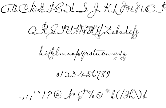
As for the font’s characteristics, the McWilliam copist used two different es, and an amazing number of different ts. I’ve chosen the more frequent e, though it’s the less conventional one, and have included as many differnt ts as I could cram into the font. On the other hand, I didn’t go along with the copist’s most frequent s — it’s barely recognizable as such –, and substituted my own K and Y for the original (rather sketchy) ones. Also, I had to fill some blanks, by creating my own U, X, and Z. And, of course, the font couldn’t do without a few alternate characters.
On the number sign of the MitreSquare font, you’ll find the copist’s number sign (N°), for a change. The other alternate characters are
a th on the ‘bar’ and ‘broken bar’ sign. This special t only occurs in combination with an h.
an alternate g on the ‘less’ sign (the regular g and y don’t connect well)
an alternate y on the ‘more’ sign (ditto)
an alternate e — the conventional one — on the left bracket
an alternate d on the right bracket
an alternate t on the left curly bracket
another alternate t on the right curly bracket
an alternate s on the ASCII tilde (the one with the extra stroke that joins the following character)
the ASCII circumflex has changed into an ASCII tilde.
And, concerning the image on the micro sign: I really couldn’t find anything remarkable about the place called Mitre Square. Apart from that one night in 1888, there seems nothing spectacular connected to it. Therefore, I turned a bit sideways, and included an image of Christ Church, Spitalfields … it’s not too far away, I suppose.
Download font
Free for Personal Use
This fonts are authors' property, and are either shareware, demo versions or public domain. The licence mentioned above the download button is just an indication. Please look at the readme-files in the archives or check the indicated author's website for details, and contact him if in doubt. If no author/licence is indicated that's because we don't have information, that doesn't mean it's free.
- MitreSqu_U.ttf
MitreSquare Regular | MitreSqu_U.ttf
- Font family: MitreSquare
- Font subfamily identification: Regular
- Unique identifier: MitreSquare:Version 1. 00
- Full font name: MitreSquare
- Version: Version 1. 00 June 2010, initial release
- Postscript font name: MitreSquare
- Designer: Pia Frauss
- Description: MitreSquare was created with the Font Creator from High-Logic. com
- License: If you want to use this font commercially, please visit http:www. pia-frauss. deimpcu. htm
MitreSquare
MitreSquare (UNICODE)
__________________________________________________
... is a font created by Pia Frauss in 2010, with High-Logic's FontCreator. You have downloaded version 1.00.
You are welcome to enjoy this font.
The MitreSquare font is free for private use. For commercial use, please visit my "Conditions of Use" page at
http://www.pia-frauss.de/imp/cu.htm
This font is based on the facsimile of the copy of a police report -- both, report and copy, were written in October of 1888 --, dealing with the murder of Catherine Eddowes, on September 30, 1888, at London Mitre Square. I found the facsimile in the folder "Jack the Ripper and the Whitechapel murders. The true story through contemporary documents", edited by Stewart P Evans and Keith Skinner (Public Record Office/The National Archives).
The pattern of the MitreSquare font having been written in 1888, with a steel pen, this is now a *genuine VICTORIAN* font. Please be so kind as to consider using the MitreSquare font, and not the JaneAusten one (Jane Austen was REGENCY, and writing with a quill pen), whenever you want to create a Victorian look, by using one of my fonts.
On the number sign of the MitreSquare font, you'll find the copist's number sign (N�), for a change.
The other alternate characters are
- a *th* on the 'bar' and 'broken bar' sign. This special *t* only occurs in combination with an *h*.
- an alternate *g* on the 'less' sign (the regular *g* and *y* don't connect well)
- an alternate *y* on the 'more' sign (ditto)
- an alternate *e* -- the conventional one -- on the left bracket
- an alternate *d* on the right bracket
- an alternate *t* on the left curly bracket
- another alternate *t* on the right curly bracket
- an alternate *s* on the ASCII tilde (the one with the extra stroke that joins the following character)
- the ASCII circumflex has changed into an ASCII tilde.
The image on the micro sign is based on a 19th century engraving of Christ Church, Spitalfields.
_________________________________
Disclaimer:
1. The designer as well as owner of this font is Pia Frauss.
2. This is a free font, but it is restricted to personal use only. Commercial use may be obtained by paying a licensing fee.
3. This font may not be included in any commercial compilation of fonts, be it on CD, disks or other products, without the owner's permission.
4. Altogether, this font may not be used for commercial ends and financial gain without the owner's permission.
5. This font may be freely distributed, as long as the zipfile, including this text, remains unaltered.
6. This font comes as it is. There is no warranty -- express or implied -- offered by the owner, or supplier. The risk of any losses or damages resulting from the use of this font remains wth the user.
If you need any information not supplied by this or by the http://www.pia-frauss.de/ website, please write to fonts @ pia-frauss.de (please remove the spaces around the *@* before copying the address into your mail form).
(However, please note that no enquiries such as "how do I download/install/get such and such program to work with your fonts" will be answered in the future.)
More by Dafont Free

Fieldwork font
Download Fieldwork font free | Dafont Free
Bidzina font
Download Bidzina font free | Dafont Free
57 Futura font
Download 57 Futura font free | Dafont Free
Comments (0)
Lastest update
Fieldwork font
Download Fieldwork font free | Dafont Free
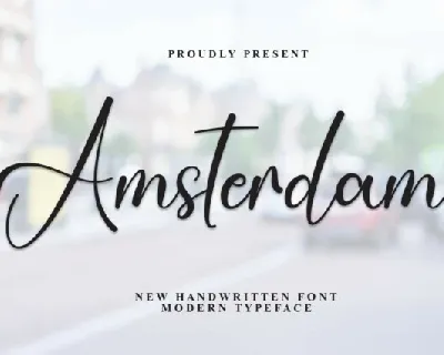
Amsterdam Script font
Download Amsterdam Script font free | creativeletter
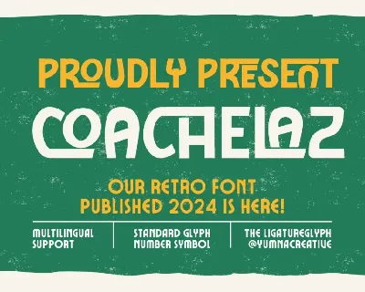
Coachelaz font
Download Coachelaz font free | Yumnacreative
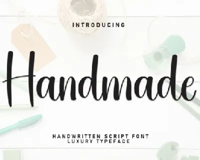
Handmade Handwritten Typeface font
Download Handmade Handwritten Typeface font free | creativeletter
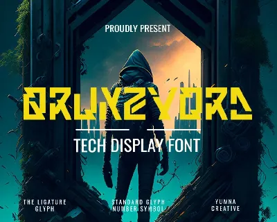
Qrunzvord font
Download Qrunzvord font free | Yumnacreative
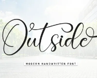
Outside Script Typeface font
Download Outside Script Typeface font free | creativeletter
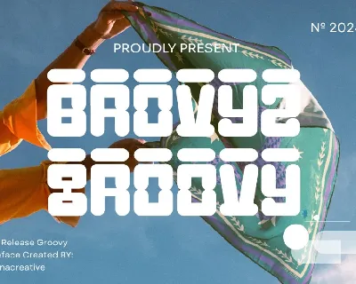
Brovyz Groovy font
Download Brovyz Groovy font free | Yumnacreative
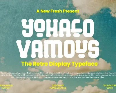
Yohalo Vamous font
Download Yohalo Vamous font free | Yumnacreative
Bidzina font
Download Bidzina font free | Dafont Free
57 Futura font
Download 57 Futura font free | Dafont Free